An exhibit on humour in the context of wellness, attracting 750+ attendees as part of KIX 2023.
ROLE
Visual Design Strategy
TEAM
Project Manager (1) Data Visualizer/Builder (1) Designer/Developer (1) Researcher (2)
TIMELINE
September 2022 - March 2023
TOOLS
Figma Adobe Illustrator
Overview
What’s So Funny? explores the connection between humour and well-being. The exhibit is aligned with the United Nations Sustainable Development Goal 3: Good Health and Wellbeing, which aims to “ensure healthy lives and promote well-being for all at all ages.”
Our exhibit supports this goal by exploring the ways that humour is interconnected with well-being; in both the mental and physical, past and present, and individual and interpersonal.
I focused on ideation, research, writing, design, and material selection. I also was able to experiment with electrical work via an MP3 trigger board.
Exhibit Summary
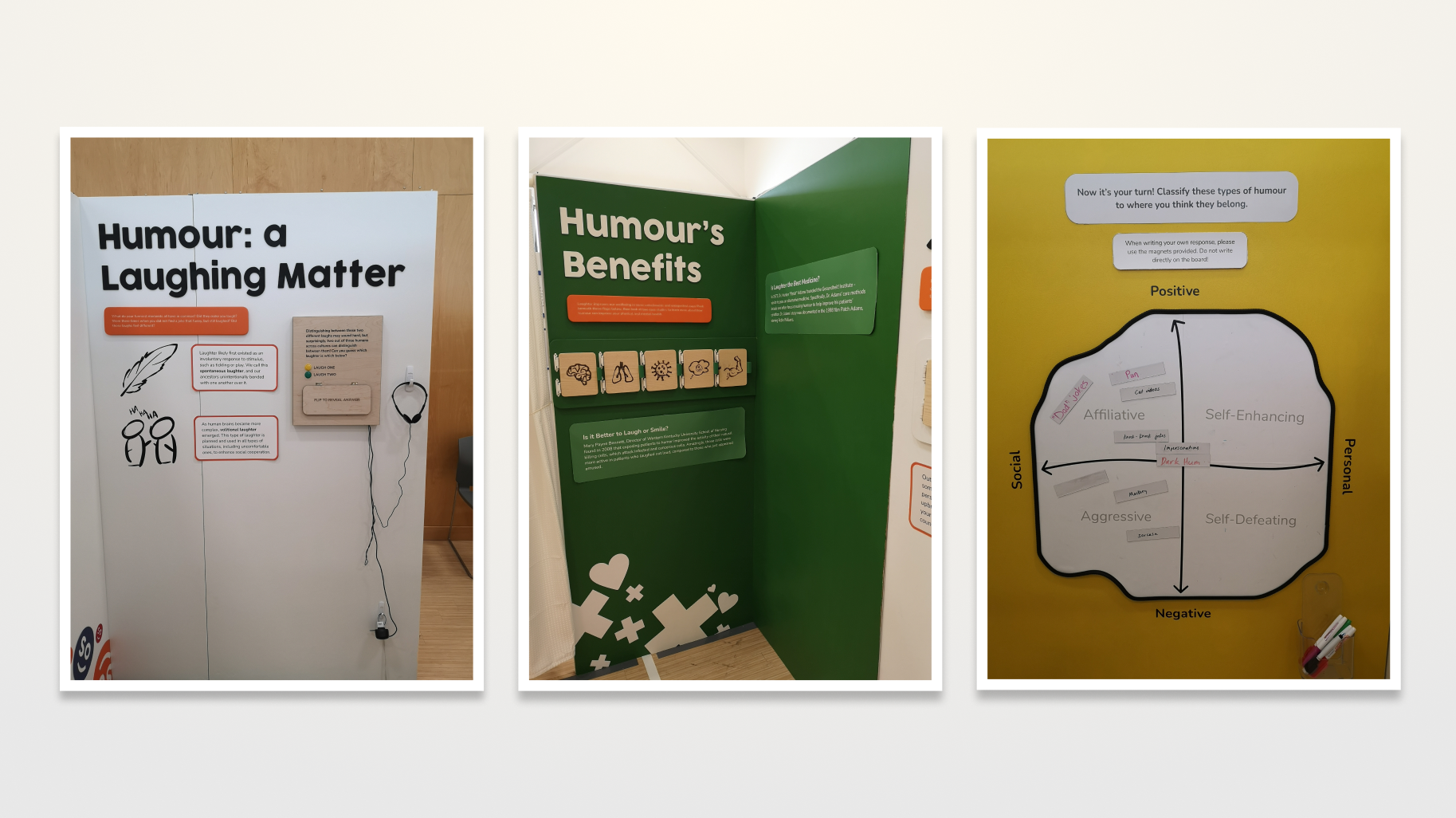
Explore the roots of humour.
Learn about humour's evolutionary and health benefits, or classify different types of humour according to how experts would!
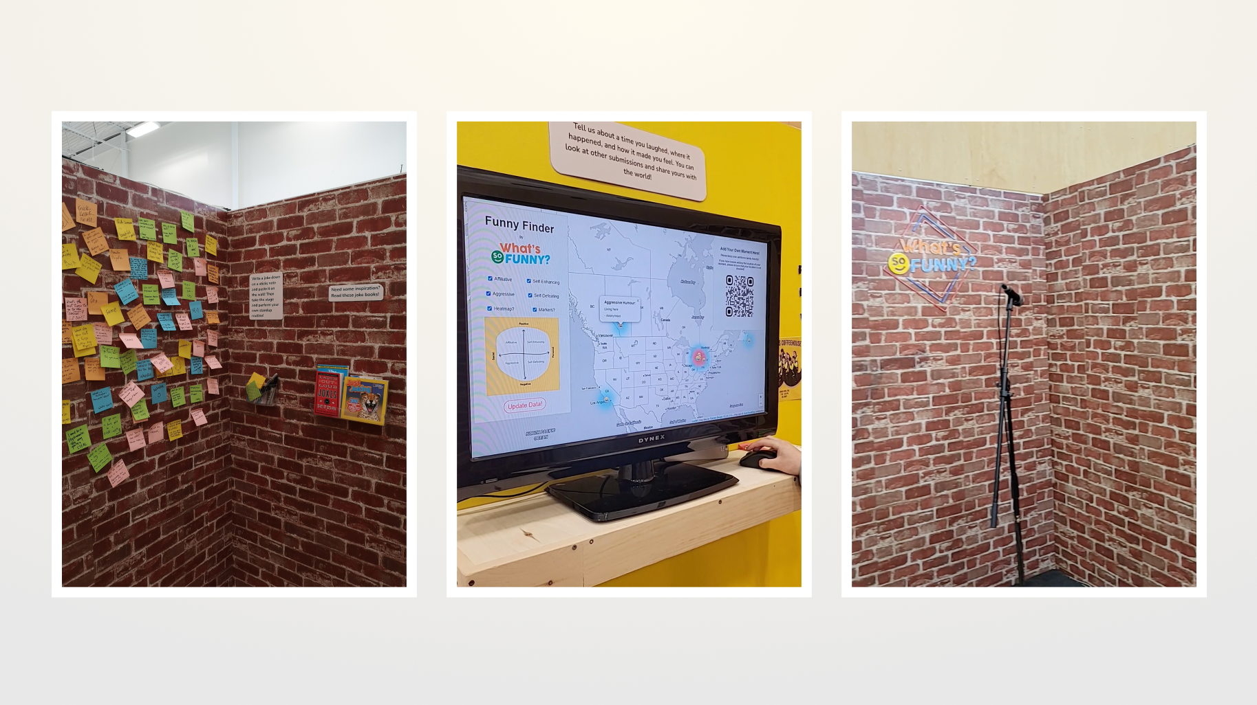
See how humour can fit into your own life.
Share jokes, stories of laughter, or try your luck at our very own comedy club!
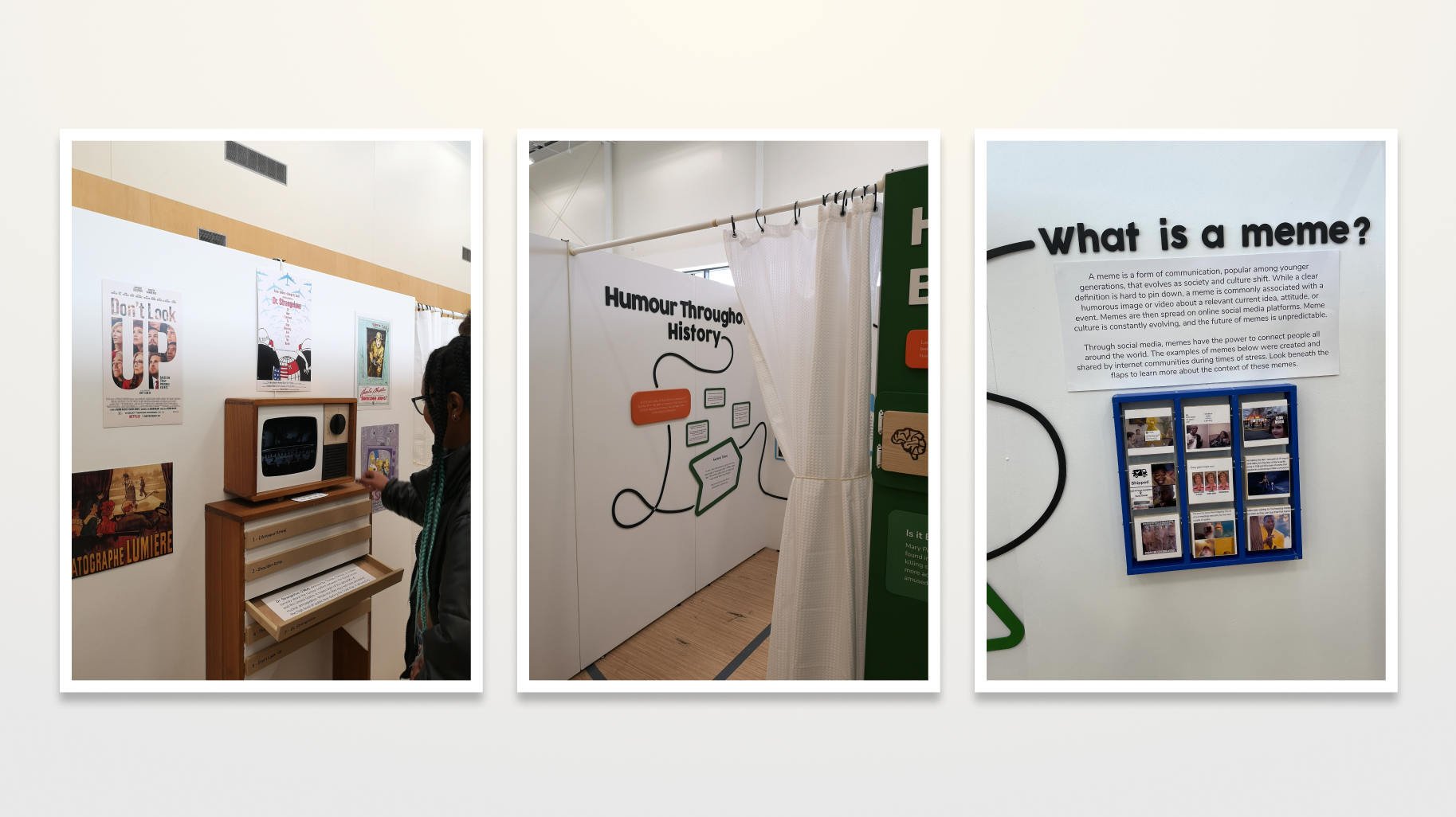
Understand how humour has helped people cope over time.
Jump into a time machine and learn about how humour has found itself at the heart of humanity. Working TV included!
Design Process
Conceptualizing a museum exhibit from idea to full pop up involved not just design thinking skills, but collaboration skills with non designers who did not always understand the importance of certain design processes.
To combat misunderstandings, a Team Charter was created that outlined expectations and feedback/conflict styles of each team member. This greatly facilitated cross-disciplinary collaboration due to mutual understanding.
Design thinking was used as the main disciplinary framework, with a series of design constraints and criteria created.
DESIGN CONSTRAINTS
DESIGN CRITERIA
Idea Generation
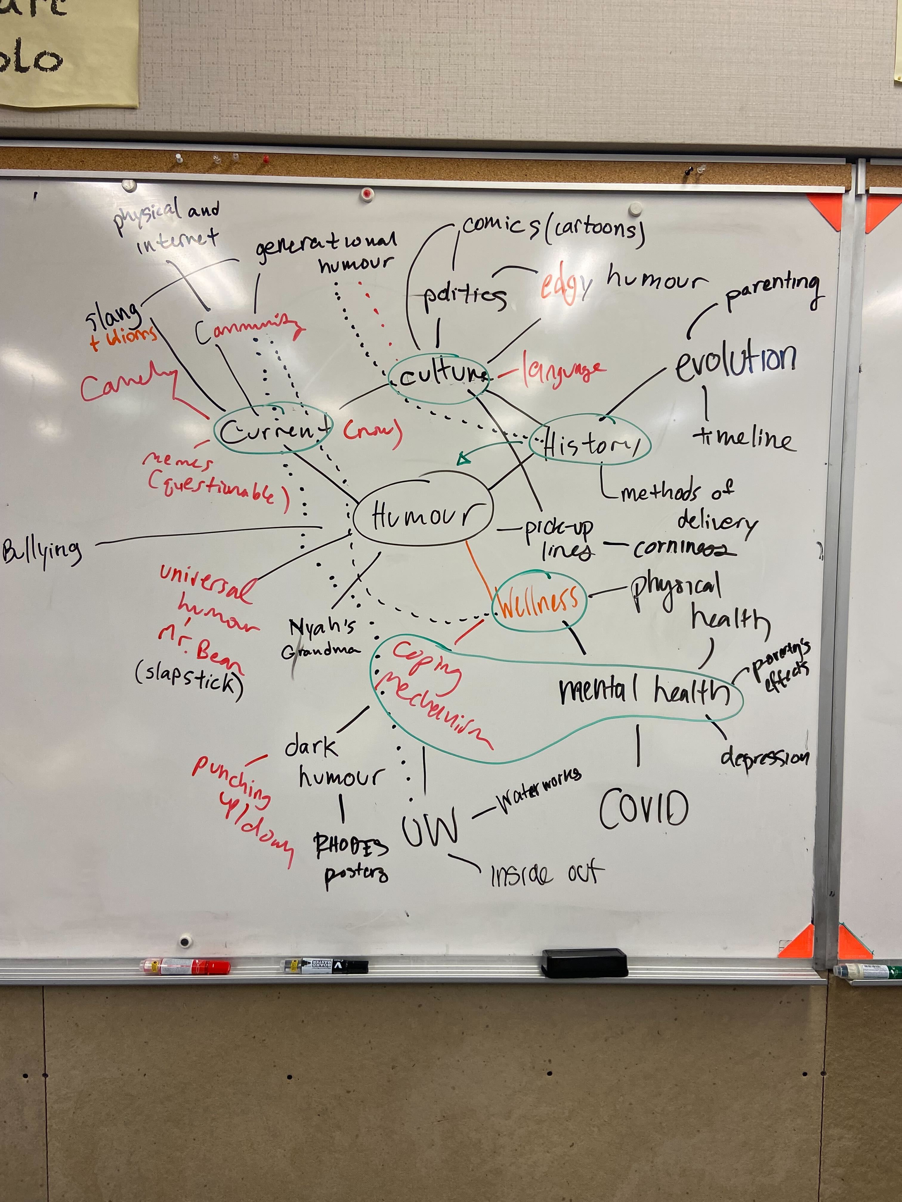
Using the double diamond process, we generated 22 ideas, fighting the urge to judge them prematurely. We narrowed them down to 8, then used dot voting to decide on humour and wellness.
The second diamond involved creating a mind map of the different connections between humour and wellness. Upon conducting research, we decided to cut three topics based on our design constraints.
We then narrowed the scope of our research, trying to focus in on key themes according to our criteria.
NARROWING RESEARCH SCOPE
Prototyping
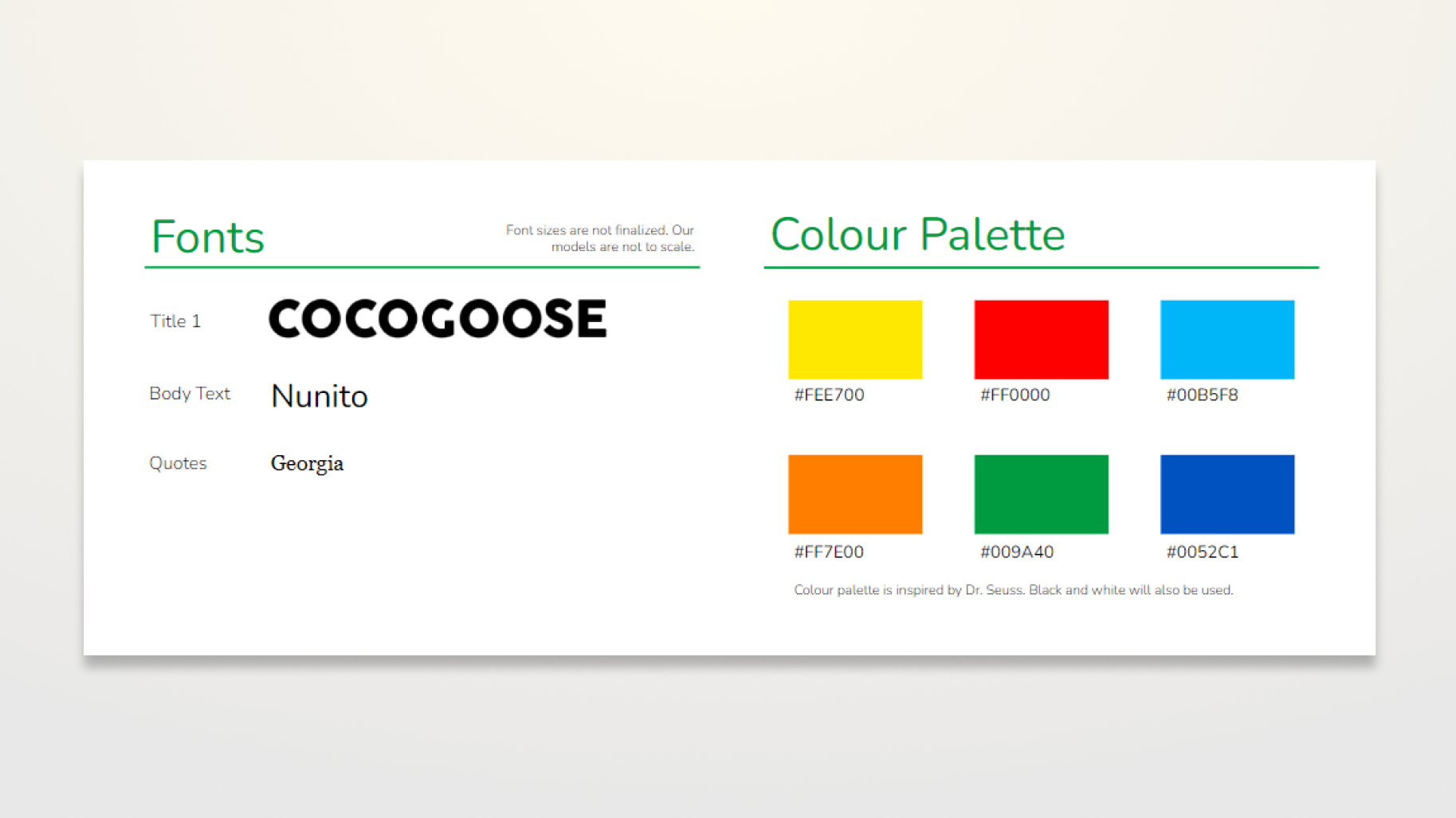
Creating brand identity.
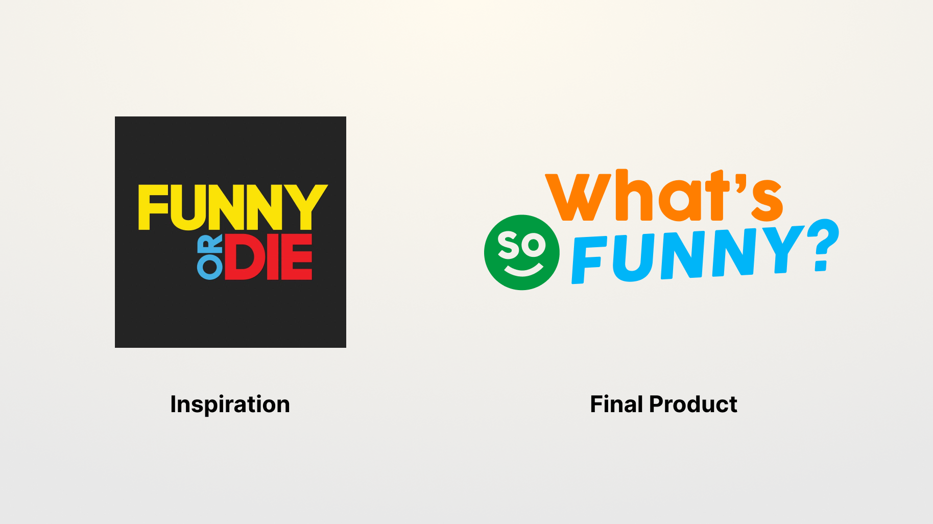
After a painstakingly long amount of time dedicated to Dafont.com and Coolors, we took inspiration from Dr. Seuss.
Logo design.
At times, my group members wondered why I was spending so long on a logo. I knew that the logo would dictate the rest of the design of the exhibit, and wanted to get the spirit of it just right.
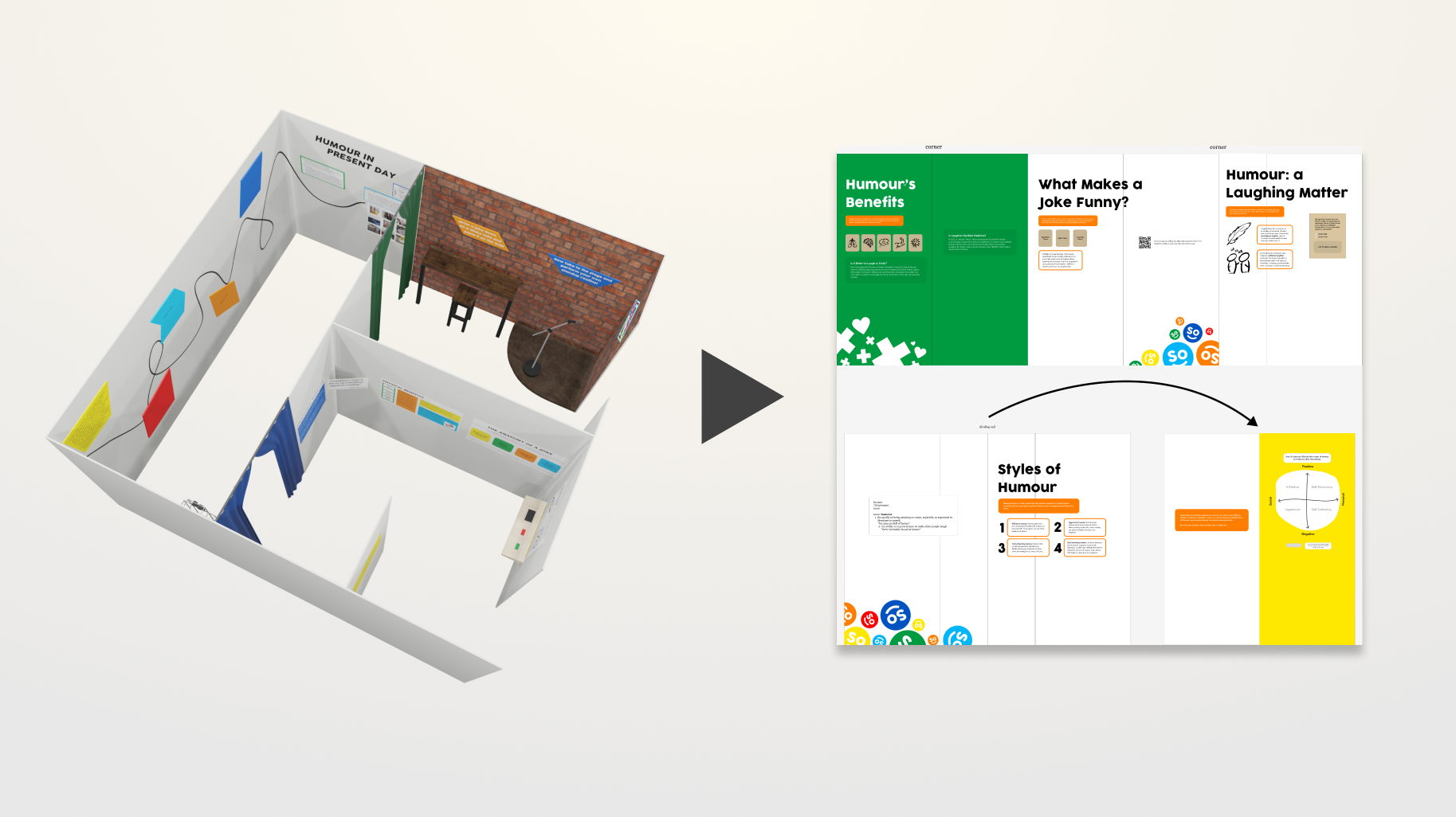
Mapping it all out.
A teammate first used Blender to get a rough idea of how things would look. Both of us later used Adobe Illustrator and Figma to prepare exhibit pieces for manufacturing.
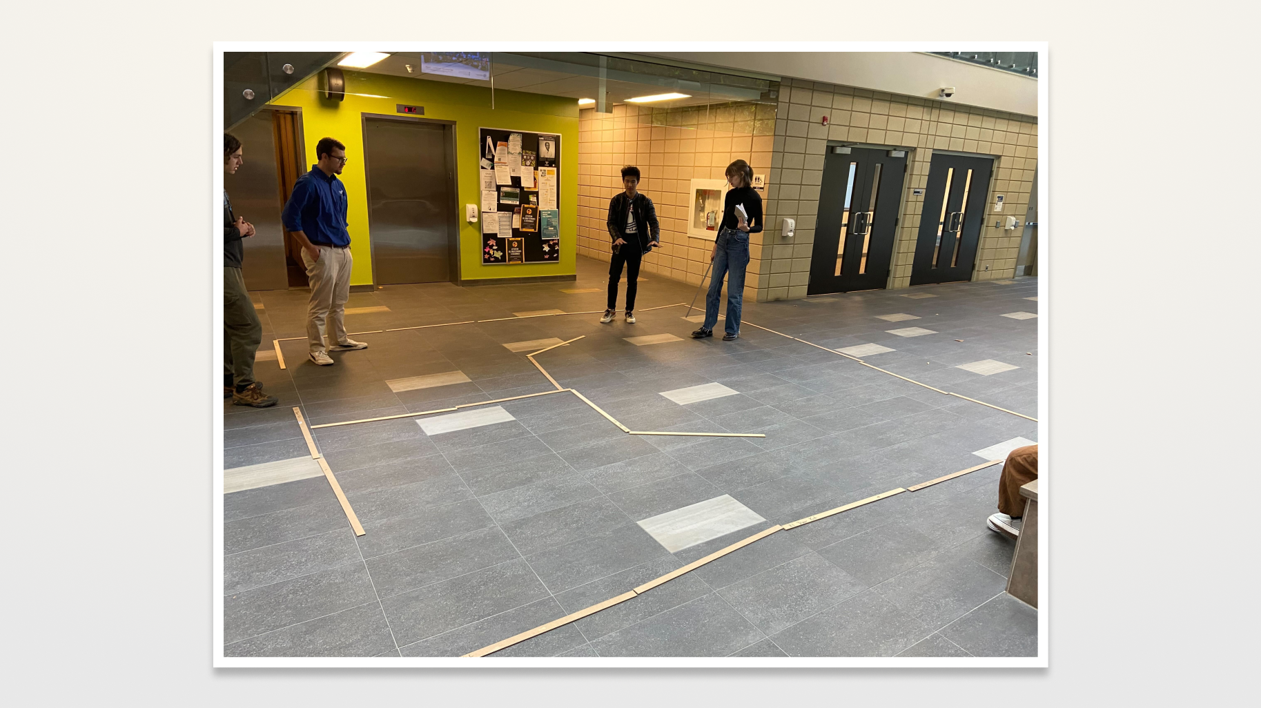
Rearranging walls.
Initial layout ideations were done through many mediums, such as sticks, lego blocks, and sketches.
Hurdles
Multiple hurdles were encountered. These included issues in demonstrating the importance of design decisions to some of my colleagues, as well as multiple issues in the procurement of materials. Multiple compromises had to be made, whether it was switching to a new material, rearranging letters to make mistakes look intentional, or reducing the scope of an interactive activity.
Hurdles were usually dealt with through the 70% buy-in rule from our design criteria earlier, so that everyone in the group was at least happy enough with the decisions that were being made. In the case of group members falling behind, a few encouraging words didn't hurt either!
Measuring Success
Feedback was taken from our course instructor, a museum expert, and a subject matter expert.
"Possibly the highest-quality execution of the year [in the museum course]. Consistency of paint, colour selection, laser-engraving, balance of white space and content, title size/phrasing … very professional."
- COURSE INSTRUCTOR
"They showed empathy for the user, planning a paced experience, such as contrasting the high amount of expository content in the intro with a very experiential outro."
- FORMER HEAD, CREATIVE @ ROYAL ONTARIO MUSEUM
More importantly, we fulfilled our criteria of a high-execution exhibit that provided new, unexpected insights on a framework that can often feel more tired than empowering.