Dashboard for Financial Literacy
Working with Extend-A-Family under UW Blueprint, I developed a dashboard that serves as the first point of contact for financial literacy learners.
This case study is still under development!
In the meantime, feel free to check out my
other work!Overview
Extend-A-Family (EAF) is a disability services agency in the Region of Waterloo. They provide a variety of support services for those with disabilities, including a financial literacy program.
This program is currently delivered via a hard copy workbook that is inefficient, time consuming to print, and hard to update. This solution also makes it hard for the agency to track learner progress and feedback.
As a result, EAF requested the services of UW Blueprint to bring a digital version of this workbook to life.
Problem
It's one thing to offer a virtual version of a financial literacy workbook, but it's another thing to ensure that upon first click, learners are equipped with the resources they need to tackle yet another module.
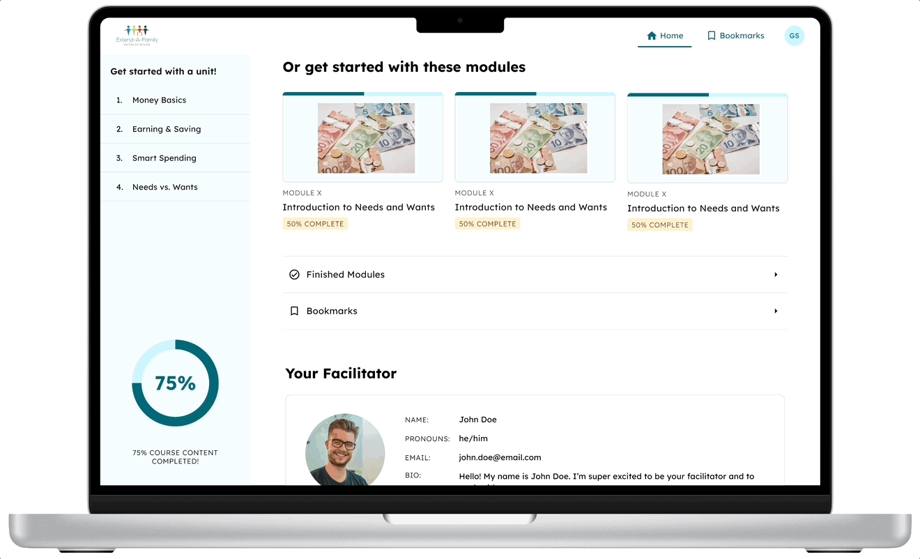
Learners may want to sift through a variety of diverse information, including finished modules, modules by unit, and their most recent modules they worked on. Learners may also want to quickly save certain parts of their virtual workbook to refer to another time.
All of this needed to be encapsulated in an easy-to-navigate and accessible dashboard.
Solution
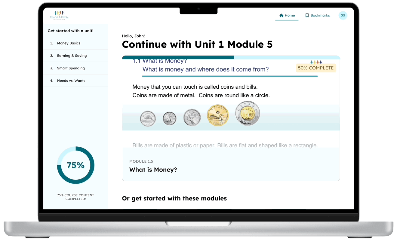
QUICK ACCESS TO RELEVANT MODULES
No more sifting through units of modules. Quickly find the last module you worked on and get right to learning.
WATCH YOUR PROGRESS OVER TIME
With knowledge of which modules you completed, see your work stack up and your learnings grow.
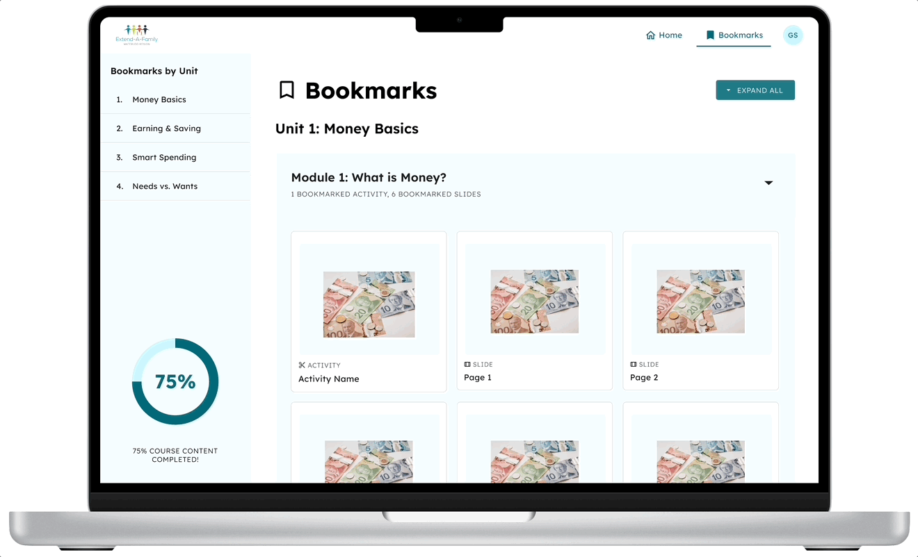
CURATE IMPORTANT PAGES AND ACTIVITIES
Whether there was something valuable in one of the module slides, or an activity you particularly enjoyed, it's easier than ever to refer back to it quickly.
Design Process
Using the existing user research on learners, I brainstormed which features would be most valuable for them. This, along with acceptance criteria, were used in discussions with my product managers to narrow down and tighten the scope of the dashboard. Developers also contributed to the conversation, letting us know what was most feasible.
In the absence of being able to conduct usability testing on learners (due to availability), I sought out critique from the other designers on UW Blueprint. I also used plug-ins like a11y to ensure there was adequate legibility.

