Making a difficult first step feel possible
Content note: This case study discusses suicide and suicide prevention. If you’d prefer not to engage with this topic, you can explore my other case studies instead.
ROLE
Product Design
UX Research
Development
TEAM
1 CTO, 2 Co-Founders, and myself
TIMELINE
Oct 2025 - Feb 2026
TOOLS
Figma / Copilot
Hope Kit is a 10-week therapy progarm for those who have considered/attempted suicide. It combines an online workbook program with support from a trained therapist — an unconventional combination in Ontario's mental health space.
Over the course of five months, I worked with this small healthtech startup to design, create unique graphics, test and develop their webpage.
The website needed a redesign.
Hope Kit hired a different designer for their landing page, but the resulting designs were ill-fitted for the company vision. Furthermore, their CTO, having more experience in backend development, struggled to implement the wireframes.
The result was a webpage that some colleagues even remarked as "depressing" — the opposite of what the founders were looking for.
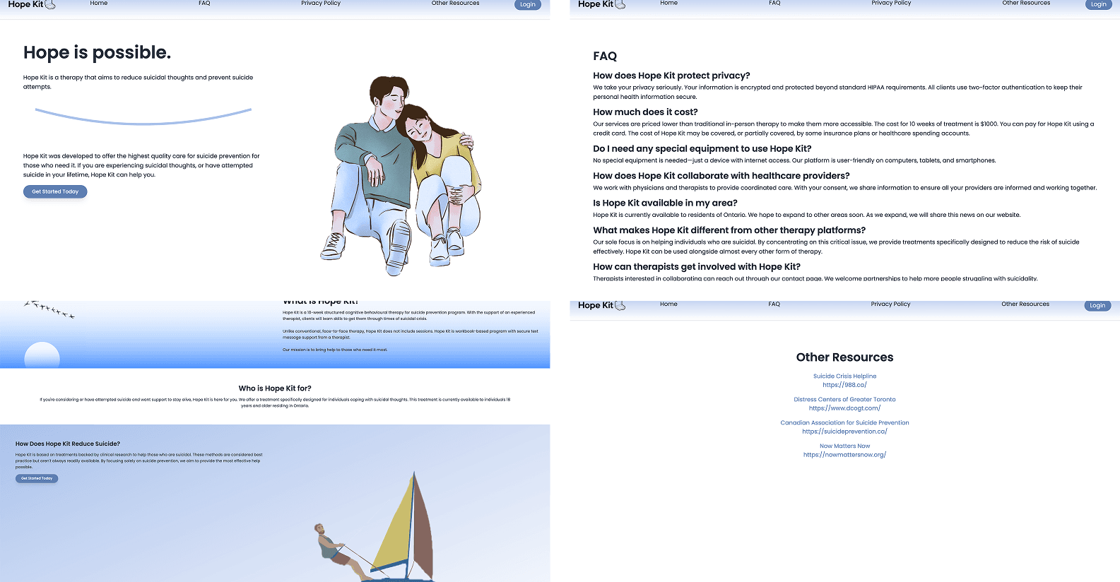
A dull colour palette, inconsistent illustrations, irregular formatting, and lack of progressive disclosure...
DEFINING SUCCESS
The website needed to balance clinical accuracy with empathy toward prospective patients.
The main user for this website was prospective patients, who would be the ones deciding whether to pursue care or not. This required content to be approachable.
However, our secondary user was psychologists, who specifically want to understand if their patient will benefit from Hope Kit. They need to know the facts, including clinical terms.
This created a tension between clinical accuracy and empathy, making navigating that balance just as important as communicating the Unique Value Proposition, or creating a sense of professionalism.
RESEARCH AND IDEATION
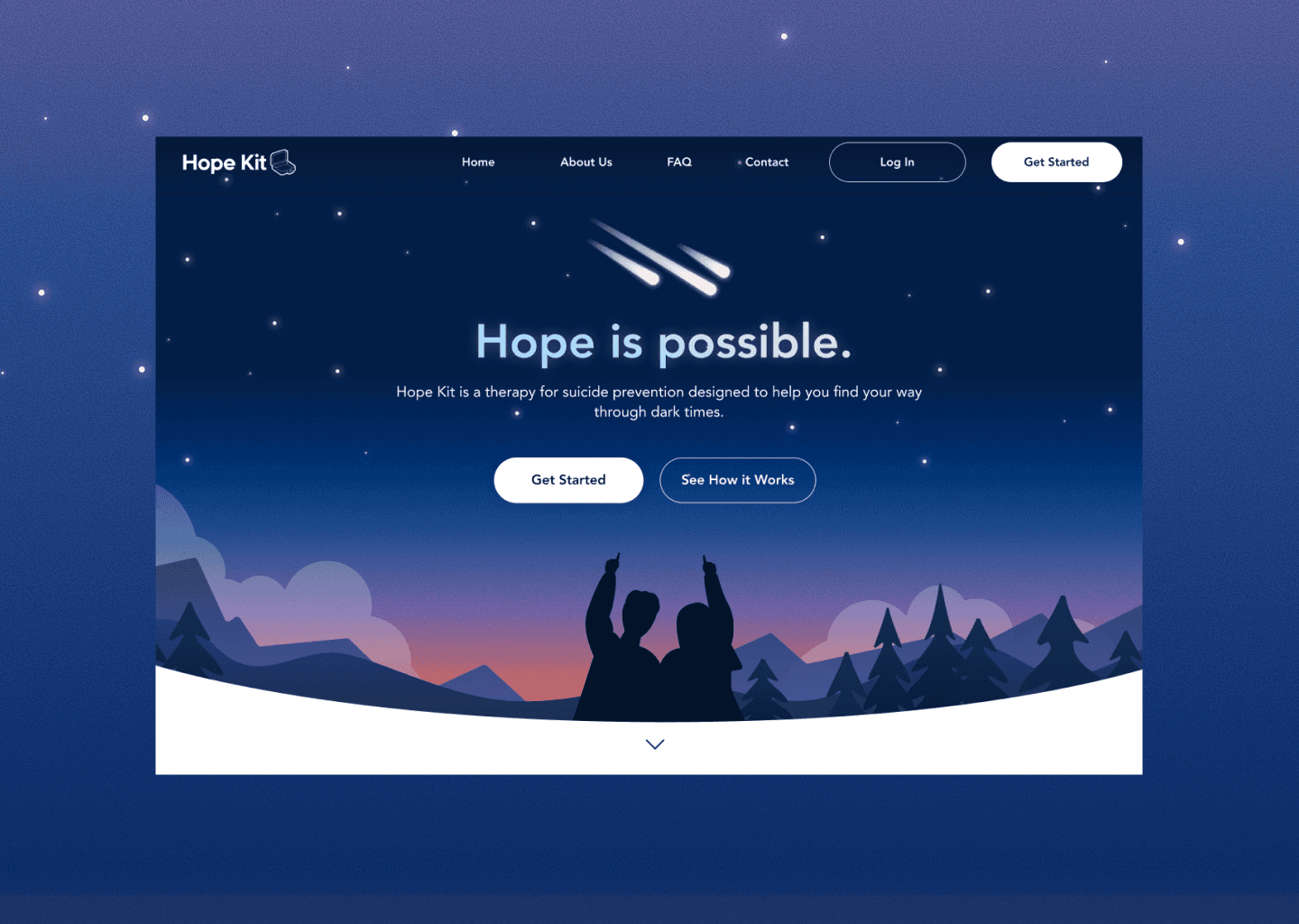
I created a cohesive theme inspired by the word "hope".
I first scheduled a session with the Co-Founders to discuss motifs to include in the website. After landing on constellations, I created a moodboard with some visual inspiration.

However, I still felt that my moodboard needed to be supported by research, so I did an online safari to immerse myself in the POV of those seeking help. I found one common theme:

The hardest thing was knowing that I could/was allowed to ask for help.
Patients didn't need another mental health cliche. They simply needed information that was transparent and clear, and the knowledge that they could access support at any time.
FEATURE PRIORITIZATION
After conducting a comparator analysis, I settled on a structure for the page.
We focused our energy on high-impact items like an elevator pitch and breakdown of the process, especially since Hope Kit was unique enough that we needed space to explain what it was.

The Hope Kit landing page journey
TESTING
To my surprise, trust went down as testing participants read through the page.
In moderated testing with 5 participants, they encountered mismanaged expectations and vague information.
Many assumed Hope Kit was exclusively a therapy program, reducing the credibility of the program's dual therapist-workbook approach. The program was also billed as "affordable" when affordability is highly dependent on an individual's situation.
Furthermore, the appearance of a "one-person" show running the company, as well as a lack of specifics on modules reduced trust.
I made three key changes in response to user feedback.
#1: Letting prospects determine affordability themselves
I transparently named the price, instead of assigning an adjective to it. I also highlighted options, such as insurance and cancellation.

#2: Demonstrating the existence of a care team
The co-founders wanted some privacy, so adding a photo, licence number, or previous reviews were not options.
I opted to add a simple paragraph describing the team structure outside of the clinical team.

Dealing with this many constraints in the "About" section meant that I had to rely on UX copy to convey credibility
#2: Clarifying expectations
To not overload prospective patients with content (and to not give away intellectual property), I kept module explanations brief, elaborating more in the FAQ.
Elsewhere, I removed the confusing comparisons to "traditional therapy", and added an "Is Hope Kit right for me?" section to clarify Hope Kit's offering.

Comparisons are fine, but they should be focused on fit and understanding, not a forced "value proposition"
FINAL DESIGN
I addressed issues brought up during testing while maintaining accurate copy for clinicians.
(Selected pages only. For the whole website, visit hopekit.ca! And to learn more about my process for the rest of the page, I'm always one email away.)
LANDING PAGE

REFLECTION
Sometimes the best solution is the one that makes sense to the client, not necessarily to yourself.
Although I knew that patients don’t want to be overwhelmed, I also realized overtime that my client wanted to make sure their product is explained clearly.
Sometimes, this meant prioritizing solutions that explained things in plain words, rather than organizing information in a more visual way.
We settled on short paragraphs, but if I had more time, I would redo user testing to make sure that the additional information we added did not increase cognitive load on prospects.
Thanks for coming!
Hope to see you again soon :)
allen.tz.lu@gmail.com

