Making financial literacy less stressful for learners and teachers in the classroom

ROLE
Product Design
UX Research
TEAM
2 Product Managers, 3 designers, many developers, myself
TIMELINE
Jan 2025 - Aug 2025
TOOLS
Figma
Over the course of eight months, I worked with UW Blueprint to design a financial literacy platform for Extend-A-Family (EAF) Waterloo Region, a nonprofit dedicated to assisting those with disabilities.
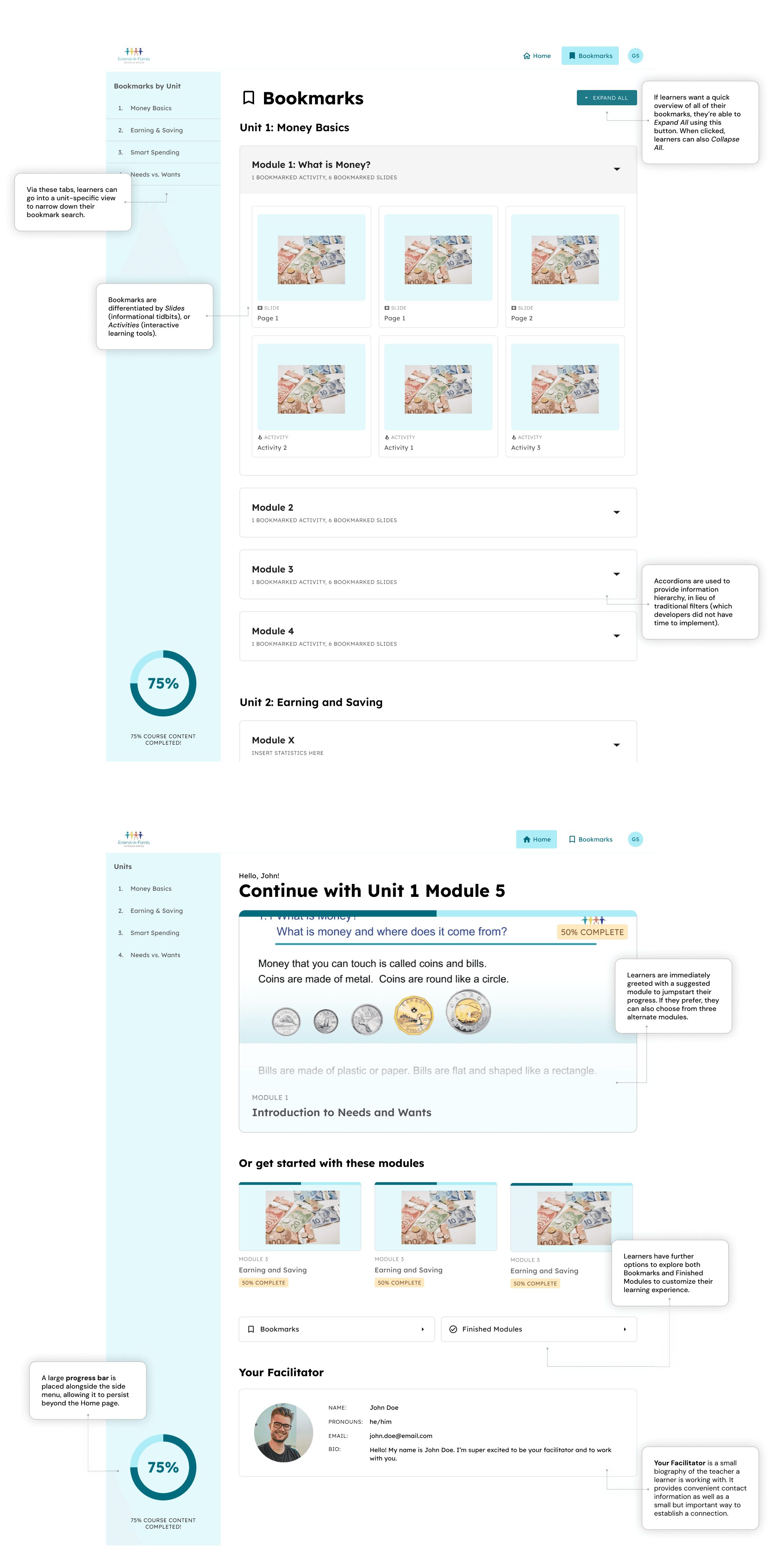
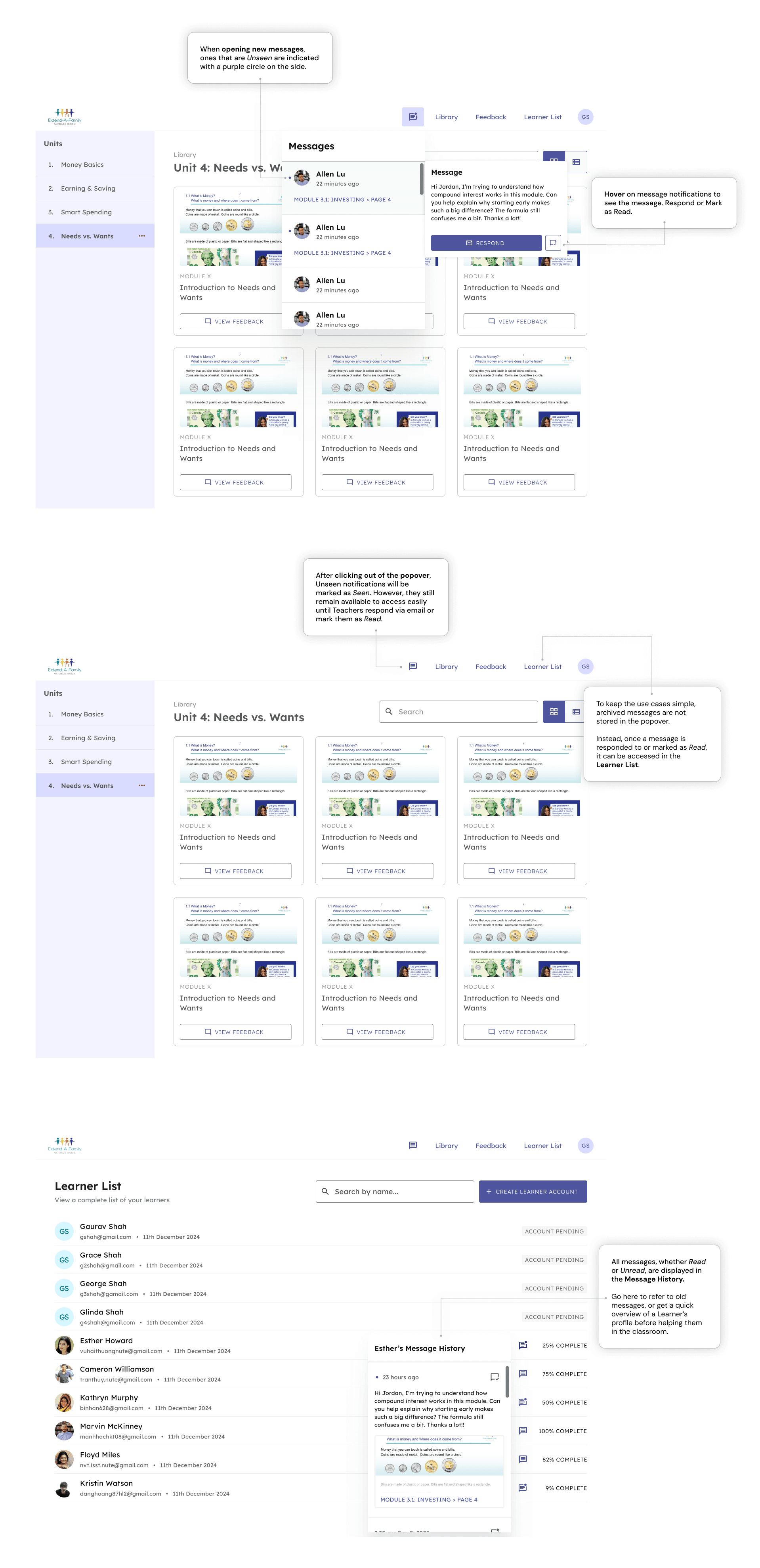
I was the sole designer for two key features: 1) a dashboard and bookmarks system for learners, and 2) a messages system between learners and teachers.
Paper workbooks don’t scale.
One of EAF’s core programs is a financial literacy course delivered with paper workbooks. That format doesn’t scale. Learners can’t easily redo practice problems. Teachers can’t see where people are stuck without manually checking every workbook. Administrators can't easily make changes to the curriculum.
The nonprofit contacted UW Blueprint to build an online platform to address all of these issues, with the main goal of reducing the stress and burden of administering this program.

An example of a workbook from EAF
CONTEXT
In a classroom, friction can quickly lead to chaos.
The classroom journey involves a deep relationship that needs adequate feedback between learner and teacher. At multiple points, this journey can fail.
I didn't realize it at the time, but I wasn't designing two separate features. Instead, I was designing two features within a broader classroom ecosystem.
ON THE LEARNER SIDE…
ON THE TEACHER SIDE…
DESIGNING THE LEARNER SIDE
Dashboards and bookmarks were deceptively simple to design for.
With the dashboard, I started off with low-fidelity wireframes from a former designer. It didn't come with a progress indicator, so we added one to align with our acceptance criteria.
However, I quickly realized that small choices easily affected the usability of my designs.
PROGRESS BAR PLACEMENT EXPLORATIONS

We ended up going with the exploration on the top right, since it surfaced the indicator most prominently while also being fixed to the screen
For bookmarks, I had zero starting wireframes, but jumped straight into high fidelity anyway (I expected the designs to be trivial). But developer constraints removed filter controls, leading me to design a flat list of bookmarks that quickly became overwhelming.
To solve this, I implemented information hierarchy through accordions and side tabs to filter by each unit.
FROM DISASTER TO ORDER WITH BOOKMARKS

DESIGNING THE TEACHER'S SIDE
Notifications can be used in many different ways. This can make them surprisingly confusing!
Many people respond differently to notifications. Some address them immediately, while others leave them to be dealt with later. These differences manifest in what a “Seen” vs. “Read” notification means to different people, as well as how those notifications are treated.
A lack of clarity on which way teachers needed to respond led to an overly complicated solution, even when it seemed I did everything “correctly”, like desk research.
DESK RESEARCH

A comparator analysis allowed me to see what would be important, which was aneasily scannable layout, references to relevant documents, and tabs to categorize messages
My early explorations were cool! But without a clear understanding of the teacher journey, I got lost in the information architecture rather than the user need, leading to a component that looked “right” but would be overwhelming for teachers to use in the heat of the moment.
EARLY EXPLORATIONS

The PM and I sat down to re-examine the user flow.
We reworked notifications to only feature unaddressed messages. Messages that were already dealt with were archived in learner profiles, a separate feature in the application. This turned the component into a live triage list, allowing teachers to prioritize in the classroom.
We also designed for the 1000th use case, removing any words that would slow down a teacher in the classroom.

HANDOFF
I liaised with developers and PMs to ensure proper implementation and edge case coverage.
We went oddly specific when we needed, including with error/loading states that gave quick information to teachers in a busy classroom, and comments on how components change over time.

An example of a component that we went oddly specific for. In the message archive for each learner, we opted for a mix of relative and absolute time, whereas for time-sensitive, unread notifications in the navbar, we went with relative time only.
FINAL DESIGN
I balanced user needs with developer capabilities.
LEARNER DASHBOARD AND BOOKMARKS
TEACHER NOTIFICATION SYSTEM
IMPACT
Positive reactions, positive impact.

[Notifications are] one of the most well-designed features of our application.
Gaurav, Product Manager for this project
These features are currently in development, with the full application scheduled to be launched in Winter 2026. Check out the GitHub repo!
Once completed, this will make a measurable difference for learners in EAF Waterloo Region’s Working Adults Learning Empowering Skills (WALES) Group, a collective of adults with disabilities who are eager to explore their own possibilities (including financial) in Waterloo Region.
Thanks for coming!
Hope to see you again soon :)
allen.tz.lu@gmail.com

